A Stepped Extension in Walthamstow
Explore this stepped extension in Walthamstow, including use of textures, blending the inside and outside for a unique look, and more
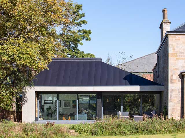
One couple were desperate to create more space on their ground floor – they wanted to create a new ‘living hub’ facing their garden at the rear of their property in Walthamstow, East London.
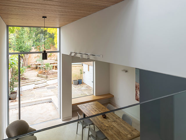
However, their existing house had a marked drop in level from the front to the back. This would require careful negotiation between layout and stepped zones in order to make their dream a reality.
We had a chat with the architect on the project, Marco Curtaz, to find out more about the extension and how they solved the issues.
“Being limited by planning height restrictions and existing ceiling and floor levels meant that the solution was to position the ancillary spaces in the darkest parts.
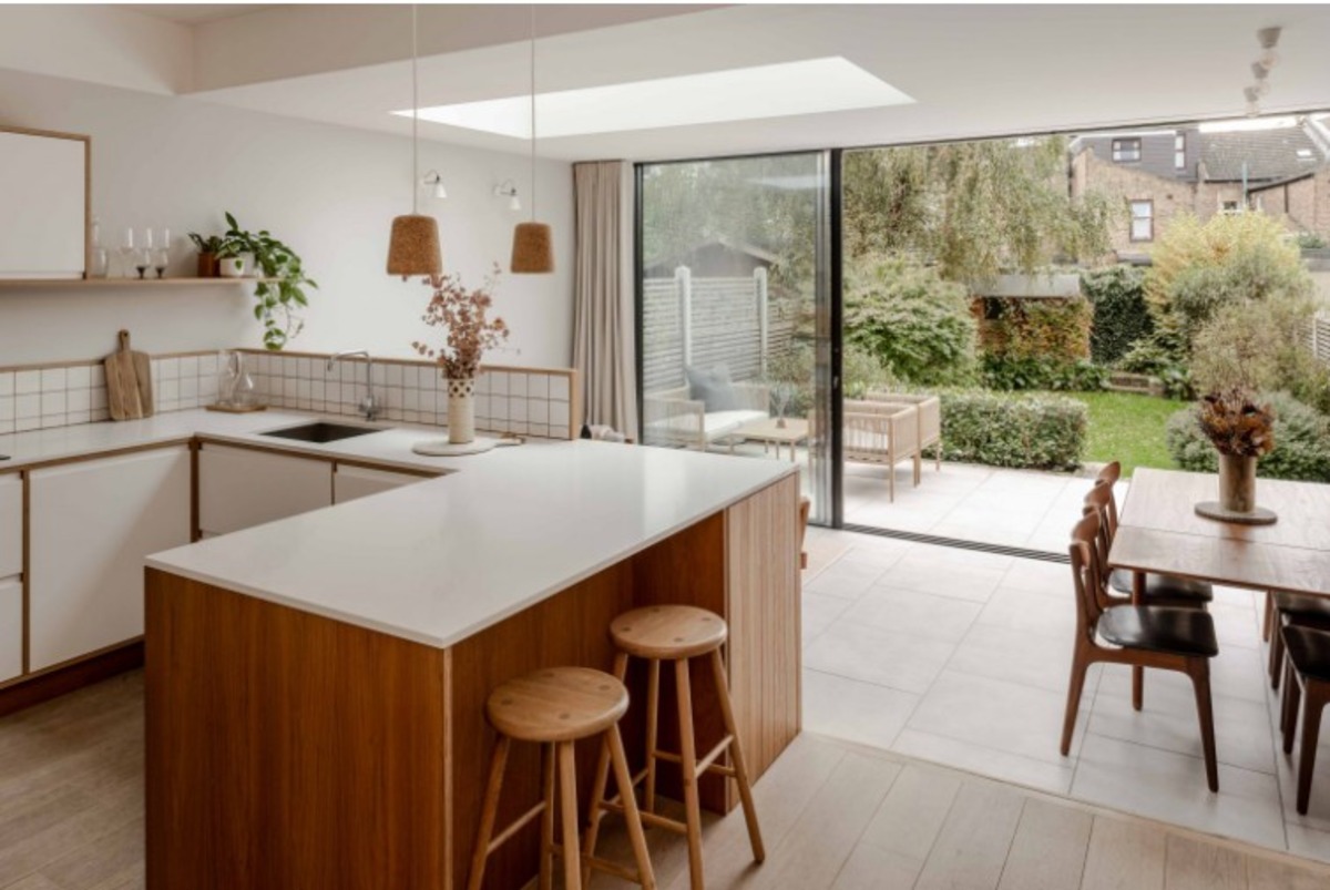
“These were served off the hallway, with the kitchen occupying its own corner within the old rear reception.
“This was lit by a wide rooflight and set a higher level, overlooking the sitting and dining spaces.
“The sitting and dining areas would be given the best light and views of the garden, with a flush threshold patio on the same floor material.
“This made the shallow extension feel like it continues outside onto the patio, therefore becoming part of the living area.
“We then added slim framed slider doors which were able to further cement the blurred divisions between inside and outside of the property.
“The aim had been to step down into the new sitting area and patio space, but we decided to keep that level a few steps higher than the garden due to risk of flooding (more on this later).”

Photo: Marco Curtaz
Materiality
“The new space has a modern appearance, with a really crisp aesthetic.
“However the period style of the other rooms in the original part of the property has been retained.
“The only area where new and old overlapped was in the kitchen space, occupying the old rear reception.
“In this part of the house a white paint band at high level, aligns with the new exposed steel beam and new doors which create a datum line high up on the wall.
“This acts as a homage to the old form plan, recreating a sense of cornice but is updated to suit the look and feel of a contemporary family room.
“In terms of materials, we were able to select options that would suit a modern and homely space.
“For example, handmade grey brick which provides character while avoiding prosaic stock brick colours.
“This pairs with clean concrete tiles to define the architecture for both the inside and the outside of the property.
“Light engineered wooden floorboards extend throughout the house, sympathetic in design with both the period rooms and the modern kitchen.
“To complete the palette, dark chestnut (referencing the Chestnut Avenue, upon which the site sits), and off-white panels form the feature joinery.
“Meanwhile, grey walls and tall units form the unique backdrop to the space.”
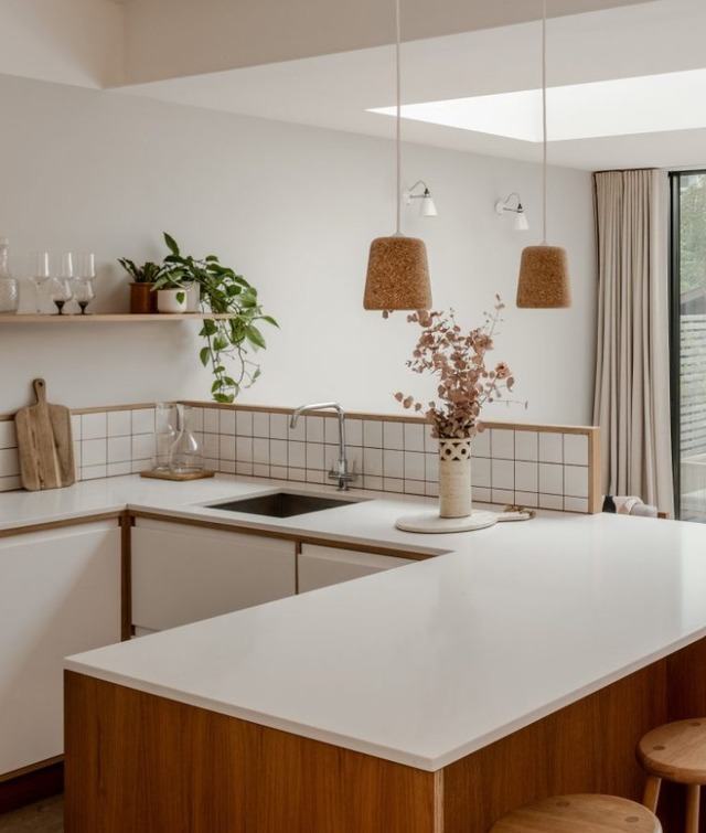
Photo: Marco Curtaz
Setbacks on the project
Unfortunately, no project is without its setbacks.
Marco explains: “During the construction period, some delays in the Suez Canal held up delivery of the sliding doors. This meant that the works were delayed and the clients had to move in before completion. This was not an easy task while juggling a newborn with allergies and a second due to be born imminently.
“This meant that the new baby arrived on the same day as the sliding doors.”
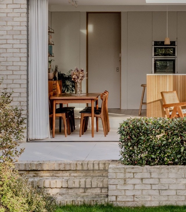
Photo: Marco Curtaz
Use of textures
The use of wooden textures and natural materials is truly stunning in this space, but how was it achieved?
Marco shares: “The use of handmade bricks was able to soften the rectilinear or modern tectonic.
“We also used chestnut wood for the joinery which really helps to inject warmth and organic texture into the space.”
“We also used solid chestnut to frame the splashbacks as they wrap around to face the sitting area.
“It’s always wise to create a splashback ‘upstand’ as this helps to hide pots and pans from a living space.
“The chestnut profiles are thicker on the frames, so the idea was to create a recess within the frames.
“This was then lined with a thin tile backer board on the kitchen side, and then tiled to make the tiles flush with the frame.
“Overall it achieves a playful yet minimal detail, which is in line with the project’s design approach.”
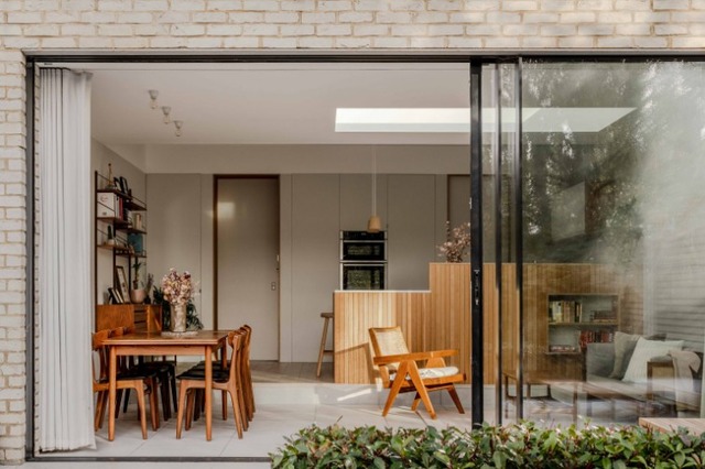
Photo: Marco Curtaz
READ MORE:

